For my firm, Equius Partners, the matrix-based investing images (US Total Stock Market Matrix and US Small Value Stock Matrix) are the bread and butter tools for introducing new prospects to asset class investing and reinforcing core principles with current clients.
The posters are indispensable
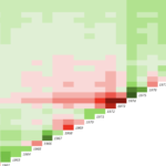
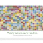
They are the anti-PowerPoint presentation experience. You’re standing up and interacting with a prospective client in front of this very unique visualization of over 90 years of US stock market history. Starting in January 1928, there are now over 4,300 index outcomes. But rather than looking at an overwhelming amount of numbers (like you would with Dimensional’s Matrix Book), your future client is looking at a beautiful array of greens (mostly) and reds (relatively few) in varying shades.
Same data, different reaction for most people—forming a very different and far healthier perspective on long-term investing in the mind of the prospect/client. You’ll build on this perspective with further discussions and in different ways. But you’ve laid an important visual foundation for them they’re not likely to forget.
The interaction
Starting with the US Total Stock Market poster, we ask “What do you see?” They almost always answer “A lot of green.” We then ask them what else they see and more often than not they’ll answer “Varying shades of green and red along the diagonal.” It’s at that point that we tell them this image represents over 90 years of US stock market history and, yes, there’s a lot of green because the market has generated positive returns (growth of wealth) over time.
We then ask them what else they see and the answer is typically “A lot of deep reds and deep green along that diagonal.” Our response: “You’re seeing deeper shades of red and green colors on the diagonal because those represent the yearly (calendar) returns since 1928. If you move up from the diagonal from any starting year, you’ll find the 1-, 2-, 3-year annualized return and so on. The white banded area is the 10-15 year holding period starting any year since 1928. You’ll notice there’s only red shades during the Great Depression era and the Lost Decade from 2000-2009. These are the volatile short-term returns that are part of any stock investing experience.”
At that point, we’ll generally just let them stare at the poster for awhile and invariably they’ll notice that the deep reds along the diagonal are almost always followed by deep greens–the market recoveries. And these green years tend to run for awhile.
We also point out the upper left corner represents the longest time period (through 2020, 93 years) on the matrix and for the US Total Stock Market the return is 10.0%, or the “expected return” for the market.
We’ll then shift their attention to the color key to the right of the matrix and point out how many returns (of over 4,300 returns) fall in the 8% to 12% range.
Finally, we share with them a perspective that seems to hit home pretty well: “Think of the diagonal as the ‘barbed wire fence’ of investing. If we can help you over that ‘barbed wire,’ we’ll get you into the ‘green pastures’ the market can provide over time. The barbed wire is unavoidable. It’s what markets do.” (How you get them over the barbed wired can either be summarized then if they ask or we save it for our Investment Planning meeting.)
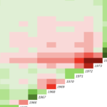
We then move to the US Small Value Stock Matrix posters and ask them”What do you see that is different from the other image?” Invariably they answer “Deeper greens throughout.” Our response is “Yes, because this represents smaller, riskier stocks that have a higher expected return than the market (since risk and return are related).” We’ve now made our first introduction to the benefits of asset class investing. We may point out the yearly periods like the “dot-com crash” and the “Lost Decade” (moving up the matrix from the 2000 until we hit 2009) and contrast those periods against the market matrix. But that’s about it. We’ve made our point.
With the Index Matrix app, you can dig deeper and develop more “scripts” and stories. But we generally use it in subsequent meetings with clients to continually enhance and reinforce their confidence in our strategy.
Handouts are killer
Our client handouts (currently 12 x 18 and more expensive then I’d like) are take-home posters with additional superpowers. You can sketch on them, clients can add their own notes to them, take them home and share with a spouse, or a friend, or a business colleague, and so on. Once I launch a better solution (hopefully soon), you’ll be able to order them in quantity, put a sticker on the back with firm info, and use them as both an educational and marketing tool. A private label option is possible in the future. Stay tuned.